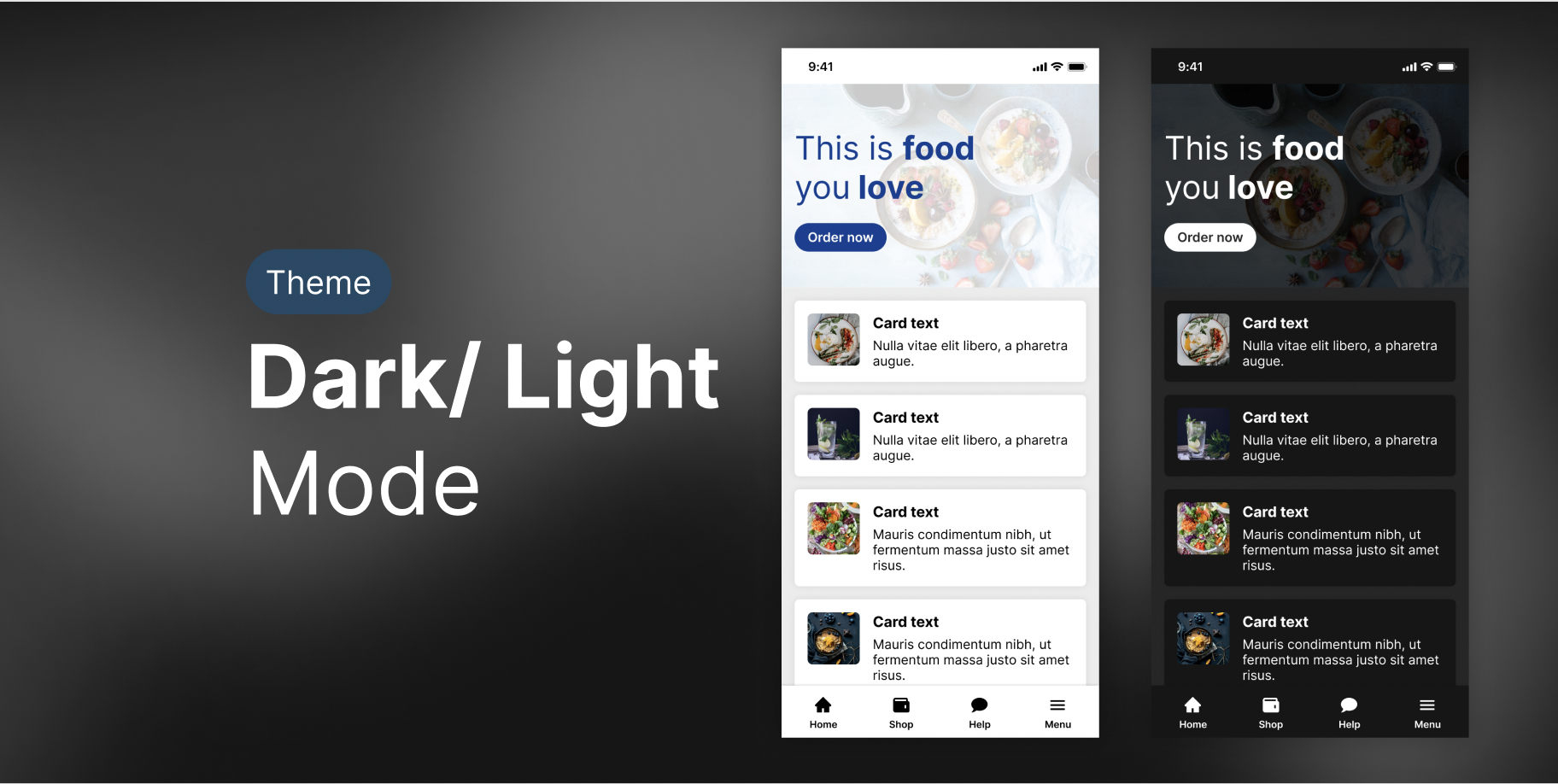
Light vs. Dark Mode
In people with normal vision (or corrected-to-normal vision), visual performance tends to be better with light mode, whereas some people with cataract and related disorders may perform better with dark mode.
Below is our curated collection of our favorite tools to use to support designing you light mode and dark mode interfaces. Also are some great resource reads to help you better understand how to approach designing these theme switches and what it means for accessibility.

Article Resources
-

How to Design Dark Mode
#article
A 2021 Guide for Mobile App Designers
-

Dark Mode vs. Light Mode: Which Is Better?
#article
From Nielsen Norman Group logoNielsen Norman Group. World Leaders in Research-Based User Experience.
Figma Plug-ins
-

Appearance By Alex Dyakov
This plugin generates a dark/light theme from your selection.
The plugin works with external library styles and local styles.
You can choose styles name identification in settings. By default, the plugin use [day] for light and [night] for dark.
-

Dark & Light Mode By Stefano Fois
This is a figma UI example using the appearance plugin. It can help you get your file set up for use.
