Design Annotations
When it comes to designing accessible components, it is crucial to consider the diverse range of users who will interact with them. The components should be designed with inclusive design principles in mind, ensuring that they are perceivable, operable, understandable, and robust. Providing clear and concise annotations is an essential best practice in designing accessible components. Annotations help developers understand the designers intended purpose and functionality of the component. By implementing these best practices, designers can contribute to a more inclusive and accessible digital experience for everyone.

Figma Resources
-

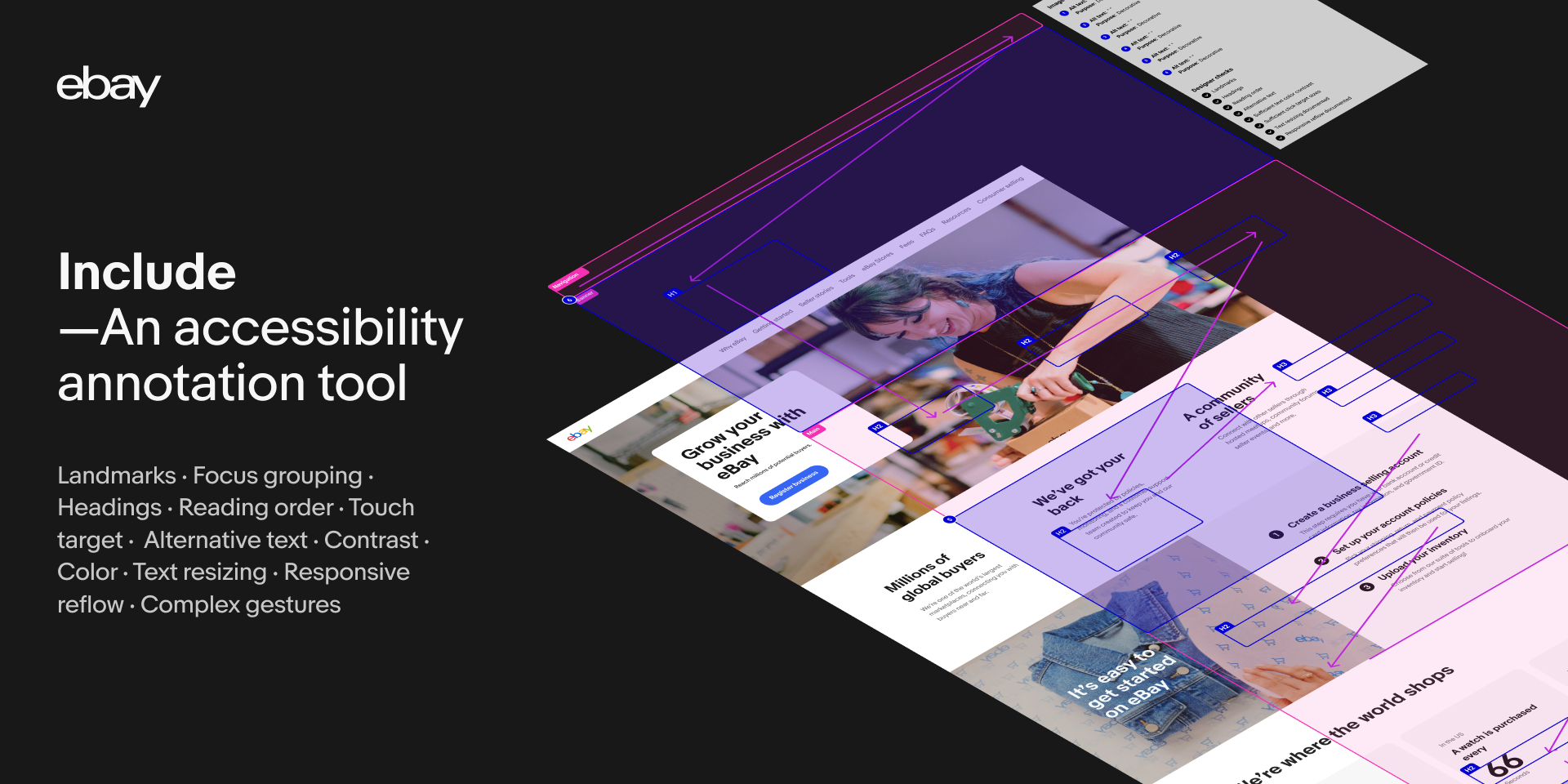
Include—Accessibility Annotations
By eBay
Include is a tool built to make annotating for accessibility (a11y) easier—easier for designers to spec and easier for developers to understand what is required. The intent is to have accessibility considerations included during the design phase of any project, and to help with the designer-developer collaboration. Ultimately creating digital experiences that anybody can use!
-

A11y Annotation Kit
By Indeed
Design and build experiences everyone can use.We use this library at Indeed to help designers document accessibility considerations to share with developers when handing off designs. It's quick and easy to add callouts for elements, indicate focus order, or specify keyboard interactions. We hope this helps others create more accessible websites and products.
-

Accessible & Flexible Input Fields
Input fields created with accessibility and flexibility in mind. Modify type, state, validation, icons, text, message and label from the variable panel on the right-hand side.
Now updated with new Figma variables.
-

Stark
By Stark
Learn the ins-and-outs of how to make your websites, apps, and more accessible from the beginning!With our community resource, you'll not only learn how to make your designs accessible, but why we do so to begin with.
Try out features such as:
Headings
Typography
ARIA
Focus order
And so much more!
