Testing Color Contrast
We perceive contrast in different colors differently. With how our eyes function, blue text on a white background will be much easier to read than if it were yellow. This is something you should keep at the forefront of your mind when designing for people—it's essential! An estimated 217 million individuals have some form of visual impairment, so keeping an eye out for contrasting color combinations can ensure that as many people can consume and comprehend your work.
Below is our curated collection of our favorite tools to use to check contrast when designing. Please note some tools are more effective when you are creating your color palette, while others are better for checking contrast on your interface design. We will identify which we prefer for each use case by using the tags #palette #interface #a11yPairs #documentation.

Web Tools
-

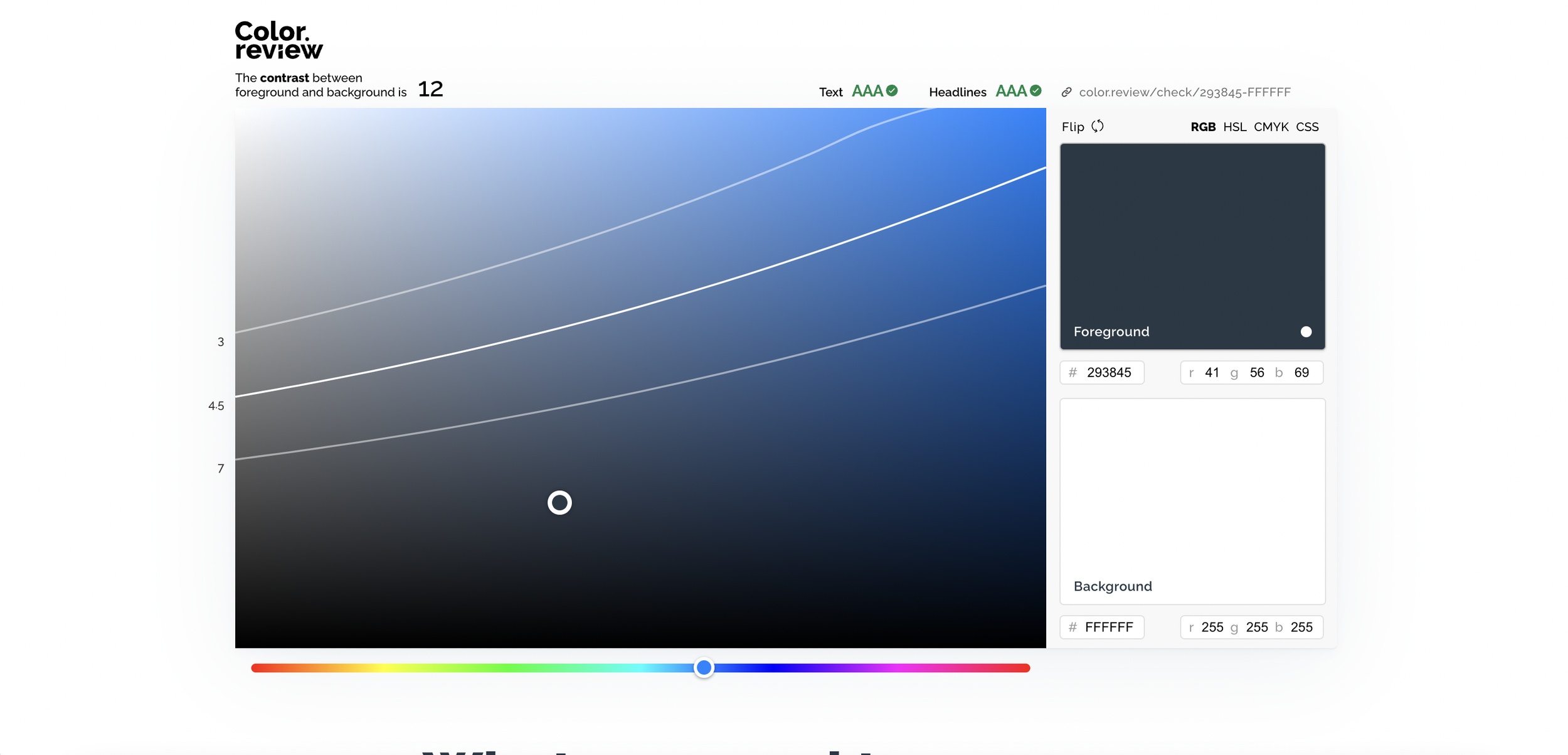
Color Review
#palette
This is our go-to when needing to check color contrast while creating palettes. The reason we enjoy this particular tool so much is that the visual editor to adjust colors is really designer friendly. In fact this is our preferred tool when we need to slightly adjust a brand color to pass contrast while making the least noticeable change.
-

Eight Shapes Contrast Grid
#palette #a11yPairs #documentation
We love Eight Shapes contrast tool for testing our entire palettes combinations. What we really appreciate is the ability to test the entire palette and all combination or define your approved text colors and only test those against your background options. Another must have for designers to drop a screenshot and link into their design system and documentation.
-

Accessible Color Matrix
#palette #a11yPairs #documentation
Once you have your based color palette, having a color matrix tool is a lifesaver! This is one of our favorite tools to compare all of your color combinations in one clean grid. We love to screenshot this and drop it in our design documentation, this way we always have a reference of which combinations pass.
-

Coolors Contrast
#palette
While this web-based tool is pretty straight forward, we included it in our list because of two reasons: First, if you are using Coolors to create your color palette, this allows you to stay in the same tool to check and adjust for contrast. Second, there is a “fix it” feature which while we don’t enjoy as much as Color Review… it can still help you get the job done.
-

Web Aim
#palette
This is your no frills contrast checker, it’s not our favorite but it’s considered a standard in the industry. It’s reliable… however we would say this one ranks last on being created with designers in mind.
It will get the job done.
Figma Plug-ins & Widgets
-

Contrast by Maark & Alex Carr
#palette #interface
This is the holy-grail contrast plug-in for Figma. Trust us! The greatest feature is the ability to test contrast of gradients and text over images.
We wouldn’t survive without this plug-in
Contrast makes it easy to check the contrast ratios of colors as you work. Select a layer and Contrast will immediately look for the color directly behind your selection and serve up the contrast ratio along with passing and failing levels from the Web Content Accessibility Guidelines (WCAG).
-

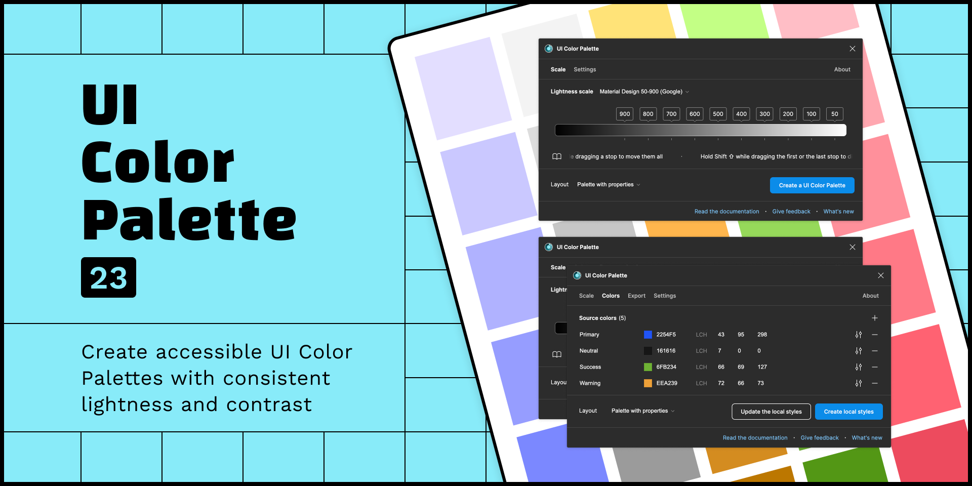
UI Color Palette
#palette #interface
UI Color Palette creates accessible Color Palettes from your brand's colors, ensuring consistent lightness and contrast. The plugin uses the LCH color model to generate color variants based on the chosen lightness scale. This model is relevant for ensuring that colors comply with the WCAG standards.
-

Color Contrast Checker (Widget)
This widget takes 2 hex codes and calculates the contrast ratio between them.
Features
Toggle the widget's appearance to be light or dark
Toggle the layout orientation to be horizontal or vertical
Add optional labels to the colors (useful for token names or steps in a color scale)
-

Stark
#palette #interface #documentation
Stark is more than a contrast checker, in fact we prefer it for other features. But, if you are a Stark Pro users you have the ability to use their color recommendations, which can be useful.
We are HUGE fans of the Stark Mac App… you should check that out as well.
Tired of manually checking spreadsheets, messy handovers, and expensive retrofitting? The all-new Stark Suite is a powerful combination of integrated tools that help you streamline your accessibility workflow.
-

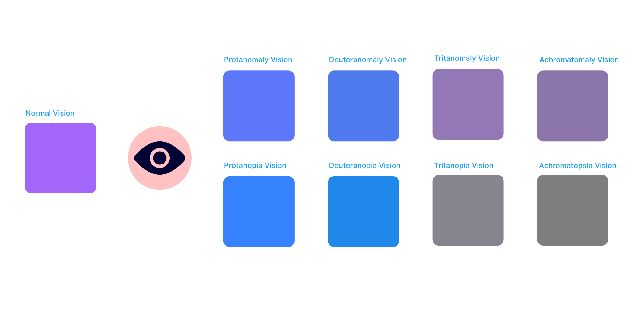
Color Blind for Figma
Color Blind allows you to view your designs in the 8 different types of color vision deficiencies.
All you need to do is make a selection and the plugin will clone it and create versions with the colors changed based on what each one would look like to a person with that type of color blindness. Each copy is contained within a group that is labelled with the color blindness type.
You can also choose to only view certain types of color blindness by toggling the checkboxes in the plugin UI.
-

AIdentic
AIdentic is an AI design assistant that helps you improving the usability of your interfaces.
AIdentic analyses your mockups, suggests improvements on different elements such as text, images, fonts, colour palettes and so on, finally applies the improvements you want , automatically, directly on your file.
